
FanFood is a stadium event mobile ordering service for concession foods. My team was in charge of designing the user app to create a seamless experience and reduce drop-off.
FanFood
UX Designer
Axure, Sketch
3 weeks
Our client, Carson Goodale, started FanFood in an attempt to disrupt the concession stand model for large entertainment venues, including concerts, sporting events, and golf courses. His product aims at providing mobile pickup and delivery services during these events. Carson expressed his concern with fans spending too much time on concessions, causing them to miss important parts of the event.
The FanFood app had 3 parts: user app, food runner app, and concession stand software. We recognized the importance of the collaboration between these parts for the best FanFood experience, but deemed it impossible because of our time limitation. We asked the Carson to prioritize the platform he wanted us to focus on, which was the user side app.

Seat confirmation screen

Menu for a specific concession stand

User's cart
Carson presented us with their issue: there was a significant drop-off for users before they reached the checkout screen. Their assumptive cause for the drop-off was the experience and usability of the app in the beginning steps.

FanFood assumed asking users to log in or register at the beginning discouraged them to engage with the app

Another assumption for drop-off was the lack of customization options, turning away users with dietary restrictions
They wanted our expertise in:
Bringing in previous experience, I wanted to explore the length of the log-in process and onboarding. Shortening the flow and giving users access to content faster proved more effective in my Percent Pledge project. It was also relatable to customer drop-off, since a more difficult path to the content discouraged users to continue using the product.
For the kickoff meeting, we prepared a deck and questions to ask our clients about the business model, assumptions, goals, and their expectations of our team. We also had a couple of Carson's partners join us virtually, which was a learning experience to be able to include them in the meeting.
FanFood previously worked with an outside UX designer, an experience they expressed as negative and unproductive. As a result, we were met with skepticism from some of the clients, questioning aspects of our process. Our team realized that not everyone on the FanFood side was aligned on the role our UX team was going to play.
We created a research plan with our assumptions and FanFood's. We wanted to explore some goals for our research so we could understand the:
Competitive landscape of the domain that FanFood attempted to disrupt
Existing user mental models for mobile delivery and pickup services
Existing user mental models for purchasing concession items at events
Our end goal for research was to understand people’s impressions of convenience, cost, and incentive, yet we needed context to ask users questions about these topics. We began to survey the landscape through domain and competitive research. After becoming versed in FanFood’s area of focus, we planned to assess existing user mental models, then relating these to their impressions of convenience, cost, and incentive.
Carson and his team presented us with a good amount of information regarding their field of operation, which included some domain research:
With such a large market, the leading frustration among attendees was the time spent getting food and drinks. Long lines had the greatest impact, causing people to leave if it took too long or if they missed an event in the game. The majority of respondents were open to the idea of in-seat delivery and the small amount of those that currently use it depict a market that FanFood can tap into.
While there were many positive reviews, we determined some existing pain points of their current users through existing surveys the FanFood team conducted:
“FanFood workers were overwhelmed and unorganized. It felt chaotic”

“Convenience fee is too high.”

“Took 30 minutes to get my food, it was too long.”
“Cheese was not included with the pretzels and there was no button telling me I could include it.”
In their initial attempts to solve the problem of time spent getting food, FanFood encountered issues such as organization and customer service, a function of the demand and lack of human resources. The convenience fee seemed to turn away some customers, yet it was necessary for the operation of FanFood. Finally, the organizational structure and functions within the user app were not meeting user needs.
We tackled domain research as part of our competitive analysis, expanding upon the competitors FanFood provided us and exploring indirect competitors. We found that it’s a fairly new market and a good number of stadiums have their own applications. The competitors were successful in providing a feedback loop, communicating fees, food menus, rewards, and group orders. Here are the competitors we found:

SeatServe, the closest competitor, displays an intuitive model for tracking an order. Looking at reviews, we found that they lack in customer service.

Ritual offers feedback input after orders, allowing contact support if satisfaction is low. This was an opportunity to explore a responsive feedback loop to keep FanFood users satisfied with their experience.
We established the main areas that FanFood’s competitors were operating in and which features were successful, such as bill splitting, order grouping, feedback, and information layouts. The next step was to interview and test users to determine their attitudes towards this domain.
Carson provided Cubs tickets for us, believing we could conduct our user interviews at that time. 30-45 minute interviews in a loud baseball stadium were impossible but we saw an opportunity for unmoderated observation of the environment that FanFood was attempting to operate in. The game itself was very entertaining, but we observed some insights we did not expect:
I was also able to picture the experience and some of the chaos associated with the amount of people flowing through the stadium. We put the tickets to good use, which yielded important base insights and use cases that would appear in our research in the future.

The crowded concession area left little room for mobility and keeping track of people was difficult.
The next challenge was collecting interview subjects on very short notice that would match our criteria. We reached out to all our personal networks looking for individuals who go to at least one sporting event a month and buy concession items. We had 6 user interviews, 4 male and 2 female and 4 SMEs, 3 male and one female, in-person and virtual. The SMEs consisted of a stadium director of operations, a venue manager, and 2 food runners. We gathered all our interview data and placed it in an affinity map, which gave us these respective insights:
“Sometimes I like to just get up around
the 5th inning and walk around the
stadium exploring.” -Mary
The type of event has a big impact on the experience and engagement.

“Yeah I think it’s worth it. Saves me
15 minutes.” -Wesley
Users will pay $2 to skip the line.

“You already expect long lines and overpriced foods, but you go for the experience.” -Priti
Users already possess a mental model about the concession experience.
“I usually spend 30 minutes looking for a stand that has vegetarian options for my son.” -Priti
Dietary restrictions make it particularly hard to find food at an event.
“The more up-front it is about why I’m paying for it, the less I’m going to be skeptical
about it.” -Devin
Users want to see a clear explanation of fees.
Talking to users, we first affirmed the FanFood’s assumption that users were willing to pay a convenience fee to skip the line. All of our users except for one showed interest in paying the fee. Users like Priti already expected high concession prices at sporting events. Another important takeaway was the difficulty of finding a dietary restricted concession option for users highlighted by Devin and Priti.
“The biggest problem we have is customers leaving their seats, or just not being in the
right seat.” - Divina
Users often input the wrong seat number or leave the seat before the food arrives.
“One instance we literally had to look up the person on Facebook and send them a message that we are at their seat.” -Luke
Communication with the user is difficult and limited.
“They always forget to get condiments, extra napkins, and order the wrong thing.” -Julian
Users often make mistakes when ordering.
SMEs highlighted mostly limitations with the app as well as the differences in constraints that each venue brought. This was very important because Carson's team envisioned FanFood to become a universal platform for stadiums nationwide. SMEs also evaluated the poor condition of the communication and feedback loop of the user app, shedding light on many types of mistakes that runners and staff would encounter during events.
Using insights from both SMEs and users, we proceeded to create a problem statement to outline our scope for FanFood. Our struggle revolved around including the product oriented needs from SMEs and concession stand insights from our users. We attempted to create a persona from our research to aid the process, but were hit with the same issue: the scope was too large. The byproduct of our synthesis was a realization for the necessity to narrow our area of focus. We decided to set the SME insights aside and put the product-centered process on pause. From that decision, we came to a problem statement:
Fans want to know about the concession options for a variety of reasons including diet, preference, and budget. But stadiums are big and crowded, and navigating them looking for options takes time, especially within a group.
Sports enthusiasts need an expedited way to find food and drinks that meets their preferences in order to reduce time spent walking around and increase their time enjoying the game experience.
Narrowing the focus on the user, we encompassed the most important insights from our interviews: knowledge of options, reduced time in line, and increased time enjoying the game. Building upon these main ideas, we created 3 design principles:

The product should have as few steps as possible. We’re trying to keep them in the game and out of the app.

The product should provide complete information so that users with particular needs can make informed decisions.

The product should allow for the users
to plan, make decisions in the moment,
and make adjustments when their original
plan changes.
Creating these guidelines brought clarity to the team, paving the direction of our process towards solving these 3 aspects. Now that we knew what we were solving for, it was time for the next alignment challenge: communicating this narrow scope to the clients.
We decided to create a user journey to highlight the insights which came from our interviews. When discussing the best way to present it, we had to take into account our clients: young entrepreneurs with a lack of experience in the UX process.

At the beginning of the journey, the two brothers and child want to get some snacks and beer before they sit down. They are met with long wait times and lines.
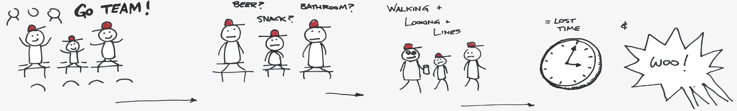
Mid game, they experience the same problem. Jimmy and his older brothers end up missing important parts of the game while waiting in line.
I noticed the FanFood team nodding their heads during the journey map, calling up some of the insights I presented a few slides before and applying it to the comic strip. They began to synthesize our insights. We understood the importance of visual cues to our clients as supplements to the insights.
After a check-in with the creative director, we decided to outline the main areas to focus on based on the FanFood asks and research insights. These were:
After mass sketching, we had too many concept areas and needed to prioritize them. I suggested the sticker method, each team member getting 3 votes.

User error, messaging, and communication was a unanimous priority. We then focused on onboarding, group orders, which we added incentives to, and decision making while searching for food.
We each drew out 2-3 concepts from our list, coming to a total of 8 testable products. Our goal for concept testing was to find the answers to the:
We tested with 3 event attendees, 2 male and one female all of whom were new testers to us. We found:


Users generally didn’t care about onboarding and proceeded to dig right into the content of the product.

Upfront customizations were only highlighted as useful by one user. The rest cited it imposed unwanted limitations on the food content.

Customization of condiments was a useful feature for most of the users, much more so than allergy and dietary preference.

Users only want to engage in communication with their food runner when something went wrong or when a problem arises.

Users appreciated flexibility in planning ahead, order splitting, and pausing orders but not all of them expressed a necessity in these features.
Testing the 3 aspects of our design principles: time, flexibility, and food information, we derived that people wanted to save time in the app, skipping any onboarding to get to the food as fast as possible. We understood that time is very valuable for sports fans, who are only willing to sacrifice it to personalize their food through condiments.
After the first round of concept testing, we were faced with another lack of direction: we had 8 divergent concepts with insights, yet no logical flow to give users an idea of how these could work together. Reaching a block in productivity, I decided to switch our focus to outlining who we were creating the product for. We came up with 2 use cases.

I pitched the exact case I observed at the baseball game: parents at a sporting event with their kids. This use case was geared towards a delivery aspect of FanFood, since I saw the clear pain points of managing one’s children within a crowded stadium. Since we established that the type of event had an impact on the experience, this use case was at a baseball game, a slower-paced event.

The second focused on a group of friends at a basketball game. Here we focused more on the pickup opportunity of FanFood. 2 of our users mentioned basketball being a more fast-paced sporting event, so we wanted to explore the other side. In this case, the friends would be getting mostly drinks and the occasional hot dog.
With use cases in mind, our team needed 2 logical flows to represent each case. We cut up all the individual screens of our concept drawings and pieced them together. The purpose was to give testers context to relate the initial concepts to each other within their use case.

We wanted to find out if our insights were validated by the use case concepts.

This concept has a quick screen explaining the functions of the app and another screen asking for a seat number. We wanted to test the amount of effort a user is willing to invest before being able to pick their food.

We also added a customer support and message feature to test the channels of communications users have to runners and staff. This concept focused on in-seat delivery.


We differentiated concept 2 by making the onboarding more action based, allowing the user to choose delivery or pickup while offering them a short explanation.
In the second round of concept testing, our team found participants to match our demographic and using our networks. For the basketball use case, we tested Dan, 37, who is the head of supply and quality. For baseball, we tested Elizabeth, 35, a marketing lead. I learned:
“I don’t usually have much time to look through an app during a game”
Users looked for ways to proceed straight to the app content without any initial investment.
“I don’t need a lot of words to choose a hotdog.”
Visuals of food helped users make a quick and informed decision.
“It feels restrictive, like I won’t see all of the options available.”
Users liked the condiments but didn’t resonate with all the other customization options in the onboarding such as dietary and allergy restrictions.
“An ETA would help me plan better. I could
take Lizzie to the bathroom and be back in
time for my food.”
Progress bars and visuals for ETAs resonated with our testers, making them more at ease and aware.
“Kind of like Uber, where you know who you’re looking for by their picture.”
Users wanted to see pictures of their food runners to personalize the experience and know who to look out for.
“What happens to my food if I pause it? Does it just sit there on the counter?”
Pausing an order still caused confusion for users.
“I have no clue how it would work, but I’d try it just to try it.”
The lack of a mental model of delivery and pickup at concession stands invited the idea of novelty.
“Oh that’s great, a free beer on my next order!”
Each user reacted with excitement to the rewards aspect of the concepts.
This round of testing validated insights from the first round and users still generally lacked a mental model of delivery and pickup at concession stands. Our concepts were successful in helping users achieve some goals, so we decided to focus on those.
We focused on improving the information and content strategy through customization and providing necessary food information. Communication and errors was our next focus, where we set out to improve the feedback loop between the runner and user. To show the value proposition of the product, our goal was to use the lack of mental model of this service to our advantage and make it easy for the users to try FanFood as quick as possible, teaching them along the way. We also realized the rewards insights weren’t in line with our problem statement, so we set them aside.
Since we had so much luck presenting visuals to the FanFood team, we decided to structure our insights into chat bubbles pointing at specific areas of the screen. By showing one screen at a time and progressively disclosing the insights, we were able to get them interested in our work. This sparked discussions about their business constraints relating to the testing insights, where I was also able to bring in our testing results for the rewards system. I let Carson know of the insights for their own benefit, but informed them that we will not be focusing on it. Will, from FanFood, brought his goal of upselling add-ons for meals such as fries to our attention when relating to our food information and personalization insights. We took note of the idea and the results of our presentation style which proved effective.
To converge the prototype, we split up the following prototype flows. I chose checkout.
Log-in and onboarding
Food selection
Checkout
Notifications and feeback
This round, we acquired 4 testers: 1 male and 3 female, all avid sport event goers. We set our users up with a scenario: A fan is at a professional baseball game. They see an advertisement for FanFood. They decide to download the app and try it out during the game. We decided to focus on:
Testing each flow with a small task for the users, we arrived at these insights:


All users chose to continue as a guest to explore the app except for one, who decided she would create an account because she is a season ticket holder and could see herself using this app again.
For onboarding, users were not very happy with the pricing of the services being shown on the first screens. While for technical reasons, the seat information was necessary to make the experience better for the user (for accurate ETAs regarding the user’s location within the stadium), they didn’t always want to add that detail.

All users customized condiments and even added fries or other sides to the order, making it easy for FanFood to upsell.

Users were influenced by ETAs and status updates, but were less likely to notice ETA estimates on the food page, but noticed it towards the end of the flow.

Users enjoyed the functionality of the order status screens. We changed the pause order function to a “switch to pickup” function which users could relate to, citing scenarios where they would actually want to go to
the bathroom and be able to pick it up
along the way.
We reinforced the idea of users not having an existing mental model of this service from testers who didn’t want to create an account without first knowing the services of this app. In regards to money, fee information up front would dissuade users from paying for convenience or delivery fees, yet all users added condiments and fries after food selection. If the first investment the user made was his goal: to select a food item; they were more likely to spend more. The visual feedback regarding the status resonated with the users, since they liked to see and not read about the status of their food.
After testing, we came to the conclusion to hand off a refined prototype to FanFood. We divided our efforts and I took lead on redesigning the prototype while my teammates prepared the final presentation. I focused on our style guide which was instrumental in keeping all the fonts and sizes consistent throughout the prototype. I utilized my skills in detecting and implementing design patterns from successful existing products. In one late night, I was able to turn our previous prototype into something the creative directors referred to as “a major improvement” which stunned the clients.

Before
I revisited the visual hierarchy while separating information sections to increase visibility for the user.
After

Before
I focused on the visual hierarchy of the delivery status and the concession stand the user is ordering from, placing it at the top. I also removed the bottom navigation to save space, since the user did not need to access their profile or notifications from their bag.

After

Before
I focused on resizing icons and separating information. I also added more information about the runner to humanize the experience more, using Uber as inspiration for completed food runs.

After
The FanFood team received the insights and final prototype with excitement, finally being able to see our findings in action. The end discussion evolved into Carson and his partners asking for our expertise about the prototype, future roadmap, and things they discussed in their internal meetings. At this point every member of FanFood was a supporter of our team and the process we employed to help the product. Adjusting and adapting to better communicate our research to the clients paid off through a positive reception of our work.
The prototype allowed the user to experience this new mental model with as little investment as possible while communicating all the information and feedback they needed.
The scope of their service was so large, that we were only able to focus on one problem their users were having. As a result, we laid out a UX product roadmap for our FanFood, outlining the next areas we would tackle if we continued working on it.
We began by addressing the insight from sprint 2: “people love rewards.” Users expressed interest and desire regarding incentives and rewards throughout our research and testing. The consideration of a rewards program would be intended to keep the user engaged with the app. Many users expressed the cost-prohibitive factors of attending professional sports events and concerts. Users expressed that they enjoy rewards-based programs in other apps they use such as Ritual. Additionally, rewards functions are not found on most competitors of FanFood, highlighting an opportunity it could satisfy.
One of our biggest limitations was the controlled environment we conducted testing in. We highly recommended for future UX/UI teams to test FanFood solutions in the environment FanFood operates in. Crowded stadiums where distraction is abundant can provide more accurate results as to how users will interact with FanFood’s product.
As FanFood continues to grow and scale to other venues and concessions within these venues, we recognized early on that improving the runner’s experience should not be ignored. Runners face the problems of order errors and not being able to find customers. Their problems are not limited to these findings, thus focusing on runners could reveal additional pain-points. Focusing on runner efficiency will help keep FanFood’s customer service and experience streamlined.
Through testing the product on users in the stadium environment, FanFood can take advantage by providing a seamless experience for fans. This positive experience encourages users to use it the next time they find themselves at an event. Implementing the rewards and incentives system will continue the traffic among existing users, motivating them to make more purchases in the app. This would drive revenue for both FanFood and their partnering concessions. Finally, the other side of the service is what will truly set FanFood apart from their competitors. Improving the runner side app and customer service continues the theme of a seamless service. It would address many of the pain points related to customer service issues seen in competitors and FanFood. Overall, the less time and effort a user will dedicate to using the FanFood app means the better their experience with the service and the more time they spend enjoying the event.
I learned to be more open minded to ways teammates have of attacking a problem or a process, learning new types of research methods. I was able to follow different processes and learn from them whether it failed or succeeded, using that knowledge to improve my methodology.
We noticed early that the FanFood team resonated with visual portrayals of our process and direct quotes from users. This was evident from their reactions of approval and head nods to those areas of our presentation. We understood that this method of communication is most effective for the clients. We changed our presentation style to match and displayed our concept testing insights as chat bubbles focusing on specific areas of the screens.
In my next project, I will employ my client skills to improve the communication of my ideas and alignment with the client. I hope to continue taking leads on rapid prototyping while having a strong presence in the other aspects of the design process. My goal is to be able to take a product from start to finish.


